Sunday 28 September 2014

Portfolio Week 1: Kingsize Studios Field trip.

Just a little bit about Kingszie and my experience:

Kingsize studios is a must visit for new and pro photographers alike. I looked at the website before going and was surprised by how interesting it all sounded. When we actually visited the studios and got to look around and talk to the people there I realised how much of a really good idea it was. Kingsize studios offer just about everything, from cameras and lens's to studios. I really liked the outdoor studio, I'll admit it was one of my favourite of the studios. I like the idea of having all the benefits of working in a studio while working outside. It was a lot more relaxed outside, like there wasn't as much pressure and I could work in that kind of environment. Inside, it was a lot more formal. The studio with the skylight was amazing, the light was perfect for almost everything. They had the option of closing off the skylight and making it a 'normal' studio. The studios, were spacious and not as intimidating as I thought they were going to be. Their website is definitely worth looking at.

http://kingsize.co.nz/

Kingsize inspired experiment:

I did a little experiment of my own involving different kinds of light. One was with natural light and the other a bright fluorescent light. These two lighting tests were both beneficial for my portfolio as well.

ISO-200. F/1.8. 1/125

ISO-200. F/1.8. 1/125
In this photograph I used the natural light coming through the window I was sitting next to. I like the softness of this light and the gradual shift from light to dark which is easily visible on the skin of my hand. I also like the contrast between the colour of my skin and the colour of the bedspread behind my hand, even in shadow, there is a line between the two colours. What I don't like is how soft this image is, I was trying to focus on the ring on my finger, but in doing so, much of the hand is out of focus as well.

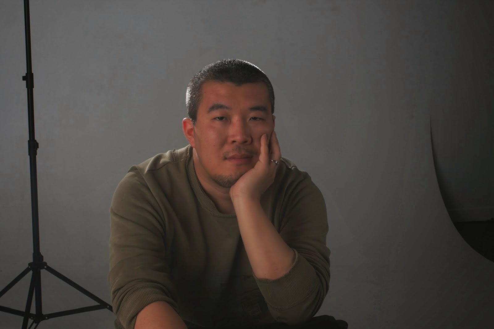
In this photograph, I used a bright fluorescent light behind me to light the image. I don't like this photograph as much. I think the light is too bright, almost harsh in some places. There's also the background, I wasn't as focused on what was in the background or what colour it was for this test, when I probably should have taken this into consideration. I don't like this hand gesture as much either, I think the first one works better within the image. I do prefer the natural light approach and all it took was adjusting one setting at a time to get the light looking almost perfect. I've decided to use similar light, probably around the same time of day, for my test shoot for my portfolio. This little experiment was helpful in the fact that I could look at the way the background effected the photographs as well as the light I used.

Portfolio Test Shoot:

This is one of the photographs from my test shoot with Kieran. I had him sitting in front of a window which provided enough light that I wasn't going to lose too much detail in the shadow. I do like this image, I like how the shadows vary across his skin and that what he's working on is almost completely in focus. I also like the fact that when first looking at the image you aren't quite sure what he's doing. There's a little mystery in the photograph. What I'm not so sure about is the background, there is quite a lot going on, but as it's all out of focus it's not as much of an issue as what it could be. I like how cool the lighting is in this photograph, you wouldn't guess that it was afternoon light. It looks more like morning light. Another thing I do like is that there aren't any hugely bright colours to distract you. The colouring in the photograph is very neutral and the only real colour is the blue light made by the light and white paper. I'm not sure if I'll use any of the images from this shoot. I want to give it a more personal, intimate feel and I think if I'd included part of his face then I may have accomplished that kind of feel, but I'll see what my other photo shoots bring and if I can work it in there then all the better.

Thursday 11 September 2014

Process: Final Hand in. (WK 8)

My focus for my final hand in was shadow and light, when researching, I looked at different kinds of light in portraiture and the ways it manipulated the outcome of the photograph. Chiaroscuro particularly stood out for me, light emerging from darkness. This first photograph, I hadn't aimed for anything like Chiaroscuro, but looking at the photograph afterwards, it's what it reminded me of. I liked this first photograph, the problem was, it was too dark and when I attempted to lighten it, I lost part of the shadow that I liked so much. It was then that I decided to re-shoot this photograph in a studio.

The studio made it much easier to get the result I wanted. I also used a different lens. The lens allowed me to have a smaller F stop, like the photographs I'd looked at during my research. The photograph to the left was my first choice (The black marks beneath his eyes only showed up when uploading to this site). The black background, half his head unseen because of the depth of the shadows, it was almost perfect. However, when I zoomed in during the editing stage, I found that it was a little out of focus. I think this is because it focused on the tip of his nose and with the narrower F stop, the rest of his face was only slightly out of focus. This was a little annoying and if I'd had the time I would've asked him to come back in and done a re-shoot in this lighting situation, except, I had a second favourite photograph that I could use.

The lighting was different for this photograph, we'd been attempting to emulate a Rembrandt style lighting. This was one of the successful photographs for that task, as you can see the triangle on his cheek. The lighting was also split in a way that it made it possible to adapt a similar style to that of the Chiaroscuro. I was able to crop this image, as it was much sharper, and alter the tones of the image so that the shadow became a lot deeper than what it is in the original photograph, I did this mainly using levels and curves in Photoshop, but also the brightness and contrast slider. Editing this image, I found it quite easy, especially now that I can properly use layers, it was easy to create groups and go through the process of adjusting one thing at a time until I was happy with the final outcome. The change to black and white instead of colour also helped this process. The shadows became deeper when I removed the colour in my final group on the Photoshop file (I did it this way so if i didn't like the black and white version I could always turn the layer off). It also made the high lights such as on his cheek lighter, but in this case it did kind of work there is a bit more brightness in the black and white version. I couldn't be happier with the end result, although I did like the edited colour version as well. I felt like the black and white showed more of what I'd been doing and also stayed within the chiaroscuro style a little better than what the colour did, it looks more like a photo where chiaroscuro was the immediate interest.

I only used one light in this photograph, but that one light was enough to create that Rembrandt style lighting situation, but to also help me emulate a small amount of the chiaroscuro as well. The studio light I used was in front and to the side of the figure. It was the angle of the direct light, with no diffuser that helped create this chiaroscuro-like photograph. During the editing stage, when I began the cropping process I attempted to aline parts of his face up with the rule of thirds grid, it wasn't very successful as I wanted a gap between the side of the frame and the lighter side of his face. It loosely lines up within this grid, but it's not so obvious.

It was quite a long process to get to where the photograph is now, but it works and I like what I was able to create from that one portrait that I happened to take during self directed time. I hadn't intended on taking a photograph that would eventually become my final, it was more that I was looking at different poses for male figures as this is something I've found quite difficult. So in trying to further my skills and knowledge, I gained an idea that turned into something I never thought I'd be able to create.


Tuesday 9 September 2014

Research: Children in Photography.

mother-of-10-takes-magical-portraits-of-her-kids-outdoors

This is another link to a mother taking photographs of her children. I love how soft these images are, the lighting and somewhat small aperture for the majority of the images makes them look almost ethereal. The colours are vibrant and beautiful, possibly a part of post production as well as in camera. The lighting, which seems natural, but could be the product of a soft box, is soft and suits the style of the images. What I've learnt from studying photographers that photograph children is that soft lighting works best, there's no harshness or sharpness in the light of any of these images. The figures themselves are sharp, with a narrow aperture that makes the background look soft. The swirl of colours that make up the background, as it's not clear what the background is, work well the figures, helping them to stand out from the background. This creates a very clear vantage point, the figures primarily in the mid-ground of the photographs, with an often indistinct background and simple or no real foreground.

Sunday 7 September 2014

Research: Andreas Gursky. (DT WK 7)

Niagara Falls// 1989// C-Print, Diasec. // 278.7 x 221 x 6.2 cm

Bangkok 1// 2011 // Inkjet print// 307 x 237 x 6.2 cm

Andreas Gursky makes large-scale, colour photographs distinctive for their critical look at the effect of capitalism and globalization on contemporary life. He studied under Bernd and Hilla Becher in the early 1980s and adopted a similar style, following the Becher's approach to photography, creating small, black and white prints. He then broke from tradition, using colour film to make a series of images of people at leisure. Since the 90s, Gursky has concentrated on sites of commerce and tourism. I like the simplicity of his works. I love the exposure and the way it takes you a moment to see what is going on in the two photographs. They almost look like paintings, with their monotone colours. The slightly abstract view of the second image is part of it's beauty. When I first saw it, I wasn't sure what I was looking at. The shadows make it look more like a rock face than anything else. The lighting in these images are both natural and both very different. There is a lot of shadow in the second, with little highlights in places to bring out detail. It almost looks under exposed. I like the two photographs, they're simple yet beautiful.


Saturday 6 September 2014

Research: Bill Henson. (WK 7)

I really like Bill Henson's work. His portraits are beautifully photographed and a real inspiration. His images are successful and for someone that started a visual arts diploma and did not finish it makes it quite clear you do not need fancy qualifications to be a successful photographer. His images are expertly executed composition wise, it's hard to tell, but it is visible in some of the images a shallow depth of field and in others a larger one. The lighting on the two portrait images shown below are quite soft, the light on the first portrait (to the left) seems more direct than the other one, there is a lot more shadow and it kind of looks like an example of Chiaroscuro, there is a lot of shadow behind her and on the image. The second is a soft image with less shadow and more direct, soft light. The light is trained primarily on her face, with shadows around her eyes, I suspect that the light was off to the side, slightly raised to accomplish this effect.

Bill Henson

Untitled 1985/86

16 November 2013 - 14 December 2013

Research: Philip-Lorca DiCorcia. (WK 7)

Philip-Lorca DiCorcia uses documentary-like scenes in his studio based works. The works are designed to look like every day occurences. The aim was to inspire the photographs spectators to an awareness of psychology and emotion contained in real life situations.

He uses very direct lighting, the figure illuminated with quite bright almost harsh light. The surrounding objects and scenery are not nearly as illuminated as the figure in the photograph. There is a sense of heightened drama in the image, as if something is about to happen. The studio is well set up, there is no reflective surfaces (table aside) that will bounce any strong light sources. It is a well planned out setting. I like this image, it's a lot like what I've been practicing on my own, having the figure in light while the rest of the image is out of focus or in darkness/shadow. Whereas my image I would have a much narrower depth of field than in his images where it is still blatantly obvious what is in the background of the photograph.
Brent Booth, 21 years old,
Des Moines, Iowa, $30

Studio: Chiaroscuro, Split, Loop, and Rembrandt lighting. (WK 7)

Low key lighting vs. High key lighting.

High key lighting- A style of lighting that is bright and even, limited contrast.
Low key lighting- One light source. Uses dark tones to create a dramatic looking image. High contrast, direct light.

Chiaroscuro lighting- Contrast between light and dark. To add depth. Usually one light source.

ISO 100- F/2-1/80
This photograph, while a little out of focus it seems, is the best example of Chiaroscuro that I have (that's not my final :).)I'm not sure exactly what the camera was focusing on as the depth of field is really narrow, I suspect that it was the tip of his nose or something minor. It shows light emerging from darkness, maybe I should've been on the other side, so the light was on the side of his face closest to the camera to properly show it, but it works all the same. I love the shadow covering most of his face, his eyes coming out, the only thing that really stands out on that side of the photograph.

Rembrandt lighting- Half the face well lit, small triangle of light appearing on the opposite side of the face.
ISO 100-F/8-1/80
Rembrandt lighting was not very hard to replicate, it was just trying to position both the light and the model in the right place. There is a loose triangle on his cheek in this image and I think we could've done a little better, but for this exercise it works. I can see an example of rembrandt lighting and I do like the effect it has. I'd like to experiment more with this lighting style and see what I can do with it.

Loop lighting- Light set a bit above eye level and around 45 degrees to the camera. Shadow off to the side. (Nose)

ISO 100-F/8-1/80
There is a small example of loop lighting in this image, it's pretty obvious, the small shadow created by his nose stands out because of the relatively direct light on his face. The shadows on the side of his face help the loop to stand out in the small space between the two shadows. Had the two shadows connected, it would've been considered a Rembrandt lighting situation.

Split lighting- Split lighting means that half the face is in light, while the other half is in shadow. There is an obvious difference between the two sides.

Butterfly lighting- High lighting angle, a shadow below the nose is created, looks like a butterfly which is where it's name comes from.

Some self directed images. (No particular week)

Here are some photographs I'd done during my practice, they are from no particular week, just a few I've found and decided to share. There is a mixture or all the practices we've learnt in class including:
-Contrasting/Complimentary colours
-Over/under exposed backgrounds
-Positive/Negative space
-Shutter
-Split lighting
ISO 100-F/8-1/80

ISO 100-F/8-1/80

ISO 100-F/8-1/100

ISO 100-F/8-1/100


These are a selection of some of my favourite images done in my own time. The first two photographs are a good show of narrow depths of field as well as complimentary/contrasting colours. I found the colours quite beautiful and for that, I included them here. The two images that followed where a show of shutter. There is some motion blur in the images, which was purposeful. I wanted the shutter to be fast enough that it would get the clouds, but slow enough that it would blur the darkened lower half which contained trees, fences, power polls and such.
ISO 100-F/8-1/100


ISO 400-F/8-1/100

The black and white image of the bench was not originally black and white. I changed it because of how contrasty the original image was. The photograph suits black and white more than it did colour, the colours were dull and washed out, but I liked the photograph. It was another spur of the moment photograph, but for some reason it stuck out from the rest. It could be an exampled of positive and negative space, it's not as obvious, but the subject matter in this photograph is very obvious, so it kind of works in this aspect. I guess you could say it is a use of leading lines, the lines leading the eye all around the image, in and out of the frame. The image of my puppy is the best example I have of split lighting. In this case I used the natural light to the right of the image. When I took the image I hadn't intended on this, but when I saw it on my computer later, it was the first thing that came to mind which is why I included it.

 Aperture priority: AV
ISO 100-F/5.6-1/80

ISO 100-F/5.6-1/80
 Aperture is something I look at quite a lot now that I can use it properly. AV mode is extremely useful in situations where you don't have a lot of time to set up M mode and just need to take the shot. This wasn't the case with these photos, I just used it to practice using the different modes. I like the image on the left more than the one on the right, it seems so different from every other image I too that day and the shadows really make the pink pop. The colours in the image compliment each other quite nicely and the narrow depth of field has created a nice effect in the background of the image.


Gallery Visit. (DT WK 7)

I really loved the gallery visit. Seeing all those works up where the pubic can see, it gives me chills and if I ever have my work up next to the likes of Mark Adams it'll be an amazing day. Seeing such beautiful photographs, put together in such a way that they were all linked even if they had such different subject matter was astounding. Being able to see all of that really put into perspective the way in which some photographs should be presented. I understand a little better the differences in presentation and how they can alter the portrayal of the photograph.

Questions:

1) Does the look of these works differ to each other in terms of sharpness and grain, and if so, do these differences affect the viewing of these works?
- They all differ in sharpness and resolution, some, such as Mark Adams work is much sharper than that of Akura Makea-Pardington. But this is not a drawback for the works, Akura's work for example suits having a softer resolution, especially with some of the story behind it. The softness of some of the works, works well for them, just as the sharpness works for others.

2) Choose a work and analyse it in terms of compositional techniques and the ideas you think the photographer is working with:
- I chose Mark Adams work Savaii, Samoa 2008. Compositionally, the structure in the work is the main focus, with the forest around encroaching in on the building. The walls of the image are very straight within the frame, as if he's standing inside the building and lined up the edges of the frame with the walls of the structure. There is a contrast between light and dark in the upper and lower frame, the forest around providing this vibrant green, trying to overcome this dark hardened lava floor. The remains of human life are once again becoming one with the earth and I think that's astounding, it's as if the forest is trying to heal the destruction caused by natural forces. The whole image is hauntingly beautiful and I'm not sure, but I think that's what the photographer was going for.

3) Comment on the framing, size and presentation. How does the framing and presentation change your perception of the work compared to when you saw it on your computer screen?
- The computer screen really didn't do the image justice. With the size of the work, you can see all the little details in the cracks and the writing on the walls of the structure. The frame works well for the image, the black frame ties with the darkness of the image itself. I think a white frame would've detracted from the image as it would've stood out a lot more, but the black frame almost molds with the image. The only problem I  had was the glass, because of the reflective surface, it was hard to see detail in the darker areas.

4) Is there anything you would do differently in the presentation of this photograph?
- I think using a different glass would've worked better for this image, the glass distracts the viewer because it's reflective, but the frame works well with it. So, cost wise, a black canvas probably would have done well for this image. I am conscious that the curator wanted to protect the image from the elements and every day life, so a frame was probably necessary. It's a bit of a balancing act.

Research: Lighting Diagram. (WK 7)

Lighting Diagrams

The above link leads you to a page with a lot of different lighting diagrams and examples. I found it helpful, especially in some different situations. The diagrams are simplistic, and with the examples they're easy to understand.

I also found the above image (through a google search) which was helpful in showing an example of how a professional would shoot a model in the studio. I like how the author of the image added in what his/her camera details were as well.
Lighting- Here is a link to the rest of the page, there are examples and diagrams for different kind of lighting situations.

Studio: Filters and Gels. (WK 7)

Filters:

-U.V filters, protect the lens of the camera. Does not effect the colour of the photograph.
-Polarising filters, cuts the reflection in an image.
-Red filters, for black and white photography, creates contrast.

Studio Gels: Are a simple way of changing the light in the studio. The gels go over the light to alter the colour in the studio rather than in post production. Can also be used to colour the background and/or to change the colour of the light on the person.

Gel on the background-
ISO 100-F/11.0-1/80


Gel on the person-
ISO 100-F/5.6-1/80

Gel on both the background and person-
ISO 100-F/8.0-1/80

The above are three examples of gels used in the studio. They are all very different because of the difference in lighting situations. The lighting adds and retracts depth from the image, the final image has a lot more depth than what the first two do. This could be because of the colour choice as well the purple is quite deep all on it's own. The orange and blue added very little to the images, the lights had been turned down quite a bit to actually see the colour on the background at all. The light on the figure looks a little gimicky so it's probably not one I would use in a serious situation. The different colours also add different feels to the image, some of them look more child-like, such as the green, but I guess in the right circumstance it wouldn't look silly at all. I'm not sure if I'll use gels in the future, maybe for a fairytale-like scene.

Friday 5 September 2014

Research: Photographing Children.

Polish artist photographing her children

The link above sends you to a website called Artfido. The website has all kinds of artistic approaches and I just happened to find one that sent me to a page with some really beautiful photography of children. The photographs are simplistic, black and white, with children going about their daily things. Having the children in their natural environment has made these images even better. As the children are her own, they would have been a lot more comfortable with her, there's no awkwardness, just kids being kids. Photographing children isn't always the easiest, but the above artist has done remarkably well. Her use of framing and shutter are what I like the most. She's managed to capture the motion of the children as they go about their activities, and kept them frozen in time. Framing is a big part of some of her photographs, especially the one where one of the boys is looking through some kind of leafy plant. His eyes are perfectly in focus, framed by the leaves around him.

Her use of black and white simplifies the noise in the image, there is a lot of depth in the shadows and nothing in the background to distract the viewer. The narrow aperture of her close up images also helps to reduce background noise. It stops little things from standing out too much and creating too much for the viewer to get distracted by. The photographs with slightly larger apertures feel a lot wider, as if there is more space in the image, this could be something she thought a lot about before hand, the way she wanted the image to be portrayed as the narrow/wide depth of field does change how it is portrayed quite drastically.

Monday 1 September 2014

Camera Practice: Imitation. (Self Directed)


On the left is the image I found when researching male model poses. I've had a lot more difficulty finding poses for men than what I did for women, so this practice task was both fun and informative. I took quite a few photos that were based loosely on the ideas I found on pinterest.  My photograph is a lot darker than the one of the left, I could use camera raw to adjust the exposure in the photograph to match something similar to the other picture. My light direction and position are also slightly different. I suspect that for the left hand picture, the photographer was below their subject, either leaning down, kneeling or on a lower step. Either way this vantage point is something that differs from my image.

Besides the obvious difference in these two photographs, the lack of rain/puddles and therefore the lack of the sky reflecting off of the ground, I think my imitation was pretty close. What I needed was to get a little closer to the subject, to allow him to mostly fill the frame. Because of the weather, the colours are a lot different as well, whereas in the first image there is a lot of cool colours, mine are quite neutral due to the overcast day. His clothes wouldn't have helped with this colour contrast either. had he worn hues such as the figure in the example photograph, the tone of the photograph would have been altered slightly as well. I know what I can do to improve my image, but as this was a practice to see what I could do when I used others images as inspiration I probably will not reshoot this image.


Note: Lighting. (WK 6)

We looked at the three point lighting system, but what we also looked at was different ways to use those lights. One of the harsher ones, that we originally used as a back light, we also used to create a halo around the model as well as some other cool things...


 I like the last two images, the use of positive and negative space is well balanced. The shadows across their faces, showing detail in the light, it worked really well and it's definitely a technique that I'll remember.
ISO 100
F/8
1/80

Note: Studio lighting-Three point lighting. (WK 6)

This session was actually really interesting, I'd had a little experience with working in a studio, but nothing so complex as what we did. Three point lighting is a basic, yet efficient lighting situation. While we were in the studio, we looked at how lighting affected the subject matter and different ways we could use lighting. The three point lighting system is pretty basic and easy to understand, there are three light, the key light, the fill light and the back light.

The key light- The key light is the main light in a shoot, it's the harshest/brightest/strongest light. The key light is generally trained on the face of the model (as it is below).
The fill light- (2 stops less than the key) This light fills in the shadows created by the key light. It prevents the shadows from getting too dark. (In the photos below the fill light is trained on the right side of his face.) The fill light is not as bright as the key light.
The back light- (Slightly brighter than the key light.) The back light seperates the subject from the background. It provides definition and highlights. This kind of light is good for illuminating the models hair.

Examples-

ISO 100
F/14
1/80
Key light and fill light

ISO 100
F/20
1/80
Key light, back light and fill light.

ISO 100
F/20
1/80
Key light and Back light

ISO 100
F/20
1/80
Back light only